A couple weeks ago I blogged about my personal experience with Coursera and now that Data Analysis and Statistical Inference has started, I decided it would be great to build small summaries of what was covered on every week of the course as I go by it.
Introduction
Here we’re presented to statistics by using the cigarette research example. Back when we started to research the effects of smoking, many people said they knew people that did smoke but felt great and while this isn’t necessarily untrue, it’s just a single variable at the whole population. That’s what we usually call anedoctal evidence and we can’t really extrapolate this to a whole population.
Going forward, another example is provided, now a research that asked:
Are consumers of certain alcohol brands more likely to end up in the emergency room with injuries?
And while the question seems to be general to the whole population, the sample selected where people that went to ER at the Johns Hopkins Hospital in Baltimore. This makes the answers produced by this research not to be valid to the whole population as the sample was taken from a very small cluster of people and from a single place, so the brands and even the way people drink in Baltimore (and of those that decided to go to the Johns Hopkins ER) coud affect the results of the research.
So we have to carefully consider what kind of answers we can actually build out of the data we have collected.
Data basics
Now we get to understand what is data, starting from what are observations and variables. The example used here comes from Google’s Transparency Report:
period_ending | country   | all_requests | req_complied | hdi
------------- | -------   | ------------ | ------------ | ------
06/30/2013    | Bahrain   | 1            | 0            | very high
06/30/2013    | Brazil    | 321          | 48           | high
06/30/2013    | Guatemala | 2            | 50           | medium
06/30/2013    | Indonesia | 3            | 67           | medium
06/30/2013    | Thailand  | 1            | 0            | high
06/30/2013    | Greece    | 4            | 25           | very high
06/30/2013    | Hong Kong | 1            | 0            | very high
An observation here is a single row of our table. A variable is one of the columns. Every dataset will be comprised of many observations of a collection of variables.
Types of variables
Variables can be of two different types, numerical or categorical.
Numerical variables are, as expected, variables where it would make sense to do math on them like summing, subtracting, calculating averages and the like. These variables are then divided into two other types, continuous or discrete.
Continuous numerical variables are usually measures of something, values that can take an infinite number of values within a range. You’ll see this in hights, weights, distances and the like where you can have any numeric value available.
Discrete numerical variables are usually counts of something, usually around a definite set of values. This could be the count of cards in a household or how many people live a household.
When deciding if a variable is discrete or continuous, think about it’s actual meaning instead of the values you can see at your observations. You could easily make continuous data look like discrete just by rounding it, but it would still be continuous.
Categorical variables are the ones that take a limited number of values. These values could be numbers, but it wouldn’t make sense to do math on them. For instance, we could define sex as a categorical variable with 1 meaning female and 0 meaning male, but it wouldn’t make sense to do math with these 1 and 0 values.
Categorical variables are also divided into two types, ordinal and regular categorical.
ordinal variables are the ones that define an intrinsic order. Imagine you’re collecting people’s responses about a restaurant and the possible values for the feedback variable are very bad, bad, average, good and very good, you can clearly see there is an order for the categories here, so this variable is ordinal categorical.
All other cases are regular categorical.
Going back to Google’s database, let’s look at what kind of variables we have:
country   | all_requests | req_complied | hdi
-------   | ------------ | ------------ | ------
Bahrain   | 1            | 0            | very high
Brazil    | 321          | 48           | high
Guatemala | 2            | 50           | medium
Indonesia | 3            | 67           | medium
Thailand  | 1            | 0            | high
Greece    | 4            | 25           | very high
Hong Kong | 1            | 0            | very high
country- regular categorical, each one is a single country name of the list of all countries in the world;all_requests- the count of all requests a country has made to remove content from google. Since it’s a counted value, it’s adiscrete numericvariable;req_complied- this is the percentage of requests that google did comply to takedown, this variable takes any value from 0 to 100 (including floating point values), so we have acontinuous numericvariable;hdi- Human Development Index value for each country. We have a collection of values sorted frommediumtovery highso this one is anordinal categoricalvariable.
Relationships between variables
Variables in a dataset can be related as in the value of one seems to go up or down based on the value of the other. When we find something like this, we say the variables are associated or dependent. Looking at the mtcars dataset we can see that there is a relationship between the MPG and weight variables:
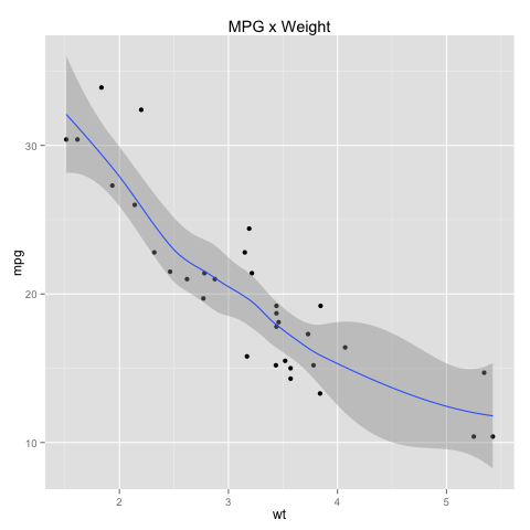
In this case, we have a negative association, as while the weight goes up, the MPG goes down. If both variables go up (or down) together, we then have a positive association.
Variables can also be independent, where there is no trend we can detect between their values.
Studies
Studies are the processes by which you will collect data for statistics. They can be observational studies or experiments.
At an observational study, researchers pick samples of the population and observe them doing the object of the research. They do not interact or affect the observed samples in any way other than to collect the data. Observational studies can be retrospective, when they collect data about events that have already happened or prospective, when they collect the data as the events occur.
Due to the way observational studies happen, they can usually only declare there is an association (or not) between variables, but they can not declare a causation. This is due to the fact that these studies won’t usually control for the other variables that could possibly affect the variables that are being measured, as the study only observes what is happening.
The other type of studies are experiments. The main difference here is that researchers will randomly assign subjects to groups to measure the variables taking into account other possible variables that could affect the outcome of the experiment. Since they are controlling for the variables directly, we can declare a causation relationship between what is being measured.
Why is this difference important?
Imagine you want to know if people that do exercise frequently feel more energy. If you’re doing an observational study, you will find people that exercise frequently and peolpe who don’t and observe if the group the exercises feels more energy.
If you find out that those who exercise feel more energy you can’t directly declare practicing exercises causes this effect because they could be exercising exactly because they feel more energy due to some other cause. All you can do is declare that there is an association between these two variables.
On the other side, if you do an experiment and randomly assign people to groups where a group will exercise and another won’t and then measure, you will have people at the exercising group that were not frequently doing it before and people who did exercise frequently at the non-exercising group.
Since the experiment has more control over the variables, if now you reach the same conclusion as at the observational study, you can declare that there is a correlation between these two variables.
Census x Samples
Why do we take samples of the population when running studies instead of going for census?
First, there is the obvious cost of running a census. Finding every single person around is hard, expensive and not necessarily a good idea. People that are hard to find could be too different from the usual population around them and not give you much information.
Then there is the time it takes. Populations rarely stand still and by the time you finish the census it might not be that useful anymore due to people having moved elsewhere.
Sampling bias
So, is sampling perfect?
Not at all, when sampling a population you can be a victim of one of the many sampling biases and this will make it not be a representative part of the population you’re trying to sample.
Some of them are:
- Convienience sample - imagine you’re a freshmen in college and you want to find out the average age of your fellow freshmen. To make it a quick exercise, you take a sample of your current class and that’s it. This sample you took won’t be representative of the actual college freshmen as you have only taken data from people near you. Very convenient but not valuable;
- Non-response - a non-response bias happens when you do actual random sampling for the population but only a fraction of the sample actually responds and produces data. This fraction that actually did respond might not be representative of the actual population anymore and might produce unreal results;
- Voluntary response - this happens when instead of going after people to collect the data, you kind of wait for them to come to you. When you expect people to take action and participate in the sample you’re getting those who voluntarily feel the need to do so and this won’t reflect the actual population you’re trying to sample (unless you’re trying to sample those to volunteer!). This is specially important if the subject causes strong reactions in people;
Sampling methods
There many different ways of sampling a population, three common ones are:
- Simple random sample - this is the simplest one, just randomly pick people from the population and you should end up with a sample that represents it. While useful, you might end up in trouble due to the randomness of the selection. Imagine your population is made of 60% females and 40% males but your sample produced 60% males and 40% females, is it representative? Not really, so you need to be careful here or pick the next method;
- Stratified sample - now we divide the population in well know groups (like males and females), called
strataand then we do the random sampling above at each of these groups. This gives us the benefits of just doing random sampling but since we have grouped the data now it’s much more likely we will end up with a representative sample of the population; - Cluster sample - this is a simplification of stratified samples where instead of sampling from all strata you randomly select only some of those strata and then randomly pick a sample of every strata. This is just like ding the stratified one above but collecting less people from the population. This could be useful if you’re sampling the population of a city, instead of going at every single neighborhood, pick a bunch of them and collect the population out of these groups instead of having to go at each one of them;
Experimental design
Experimental design is made of four specific principles, control, randomize, replicate and block.
To control means always having a group that is not receiving the treatment so you can have a baseline to compare the effects the actual treatment has. If all you had were the main group of peolpe that are going through the treatment it wouldn’t be possible for you to figure out if there really is an actual difference between those who are using it or not. Experiments should always have a treatment group (the one that actually gets whatever is being evaluated) and a control group where they should not get the treatment.
Randomize means, as we’ve said before, sampling people in a way that avoids bias, using some of the methods we have defined already. It’s always important to make sure your experiments are properly randomized so you know your population sample actually represents the population you sampled from.
Replicate means to collect enough observations to make sure there will be enough for the experiment to have any validity. Again, this doesn’t mean you have to make a census, but you shouldn’t be using you and a friend as the only points as well. This could also mean fully replicating another experiment so you can compare your results with the results already available.
And last but not least, blocking. Also related to how we’re building the sample of the population to be at the experiment, we have to consider other variables we’re not measuring directly when building our sample. If doing an experiment of how much spice people will tolerate, you have to consider blocking for people that are used to eat spicy food or not, if you fail to block for a variable like that your experiment could lead to bogus results as people not used to spicy food will have a lower tolerance to it.
When sampling, you have to separate the subjects in blocks first and then start assigning them to the treatment and control groups.
Random sampling and random assignment
While random sampling and random assignment might look the same, they’re actually two different concepts that happen at two different parts of a study.
Random sampling, as we’ve discussed before, is the process by which you take a sample of the population avoiding bias, to produce a small group that is still representative of the population.
Random assignment on the other hand is the process where you randomly assign subjects from the sample you collected to the control and treatment groups of your study. Random assignment is important because you have to make sure that each group contains a valid and representative subset of the sample you have collected, otherwise you could get skewed results that might point to a result only because the group of people selected were more likely to be affected by the treatment.
Failing to do this could lead you to be a victim of confounding variables affecting the result.
What is a confounding variable?
Is a variable that correlates (directly or indirectly) with the variables you’re measuring. That’s why we need to do random assignments (and blocking) to our experiments, to make sure that these things are accounted for.
Now let’s look at a small table that summarizes the importance of random sampling and assignment:
                   | Random Assignment  | No Random Assignment |
-----------------  | ------------------ | -------------------- | ----------------
Random Sampling    | Causal and         | Not causal           | Generalizable
                   | generalizable      | but generalizable    |
-----------------  | ------------------ | -------------------- | ----------------
No Random          | Causal but         | Not causal           | Non-generalizable
Sampling           | not generalizable  | nor generalizable    |
------------------ | ------------------ | -------------------- | ----------------
                   | Causation          | Association          |
As you can see from the table, if you can do both random sampling and random assignment, you get the best of both worlds, you can deduce causation and generalize the results to the whole population. The problem here is that to do random sampling on a huge population is usually not possible, so you end up with a non-random sample but with random assignment.
If you don’t have random assignment (like most observational studies, as we’ve seen before), all you can derive is association (again, as we’ve seen before). It’s not possible to derive causation from observational studies because since you didn’t do random assignment there might be many other confounding variables involved in the process as well.
And as you can see, studies that don’t have random assignment and sampling are mostly useless as you can’t declare an association or generalize it for anything other than the people directly involved.
Visualizing numerical data
Scatterplots
There are many ways to visualize numerical data, one of them is the scatterplot:
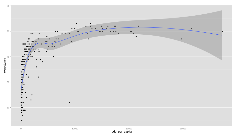
Here we can see a scatterplot of GDP per capita vs life expectancy. The graph (that uses data from 2011) shows us that there is a positive association between GDP per capita and life expectancy. When building scatterplots, we will usually make the X axis contain the explanatory variable (the one we think is causing the effect) and the response variable at the Y axis (one one affected by the explanatory) so here we could say that as the GDP grows so does life expectancy.
Since this is an observational study, you already know what comes next, all we can assume here is association, it’s not possible to say that one causes the other but merely that they are positively related.
Histograms
Another way of looking at numerical data is using histograms, let’s look at a histogram of the life expectancies:
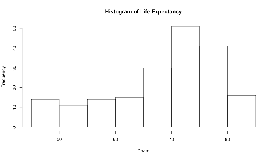
Histograms allow you to see the density of your data. Here we can clearly see that most people in the world will live from 65 to 80 years due to the way the data is skewed to the left.
Now let’s look at one that is right skewed:
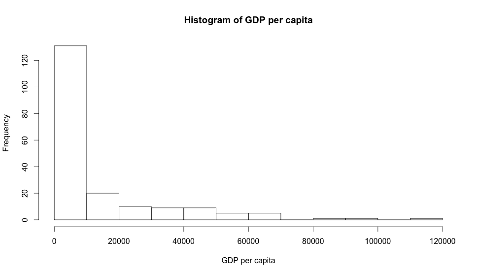
And now one that is symmetric:
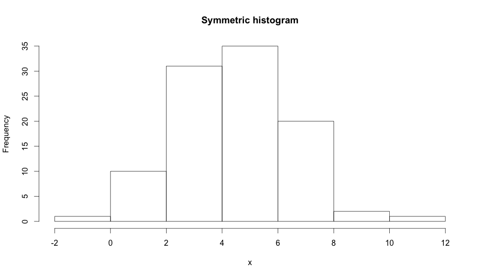
Other than their skewness, histograms can also have a modality, all 3 histograms above are said to be unimodal because they only have one prominent peak. If it has two prominent peaks it would be bimodal as in the example below:
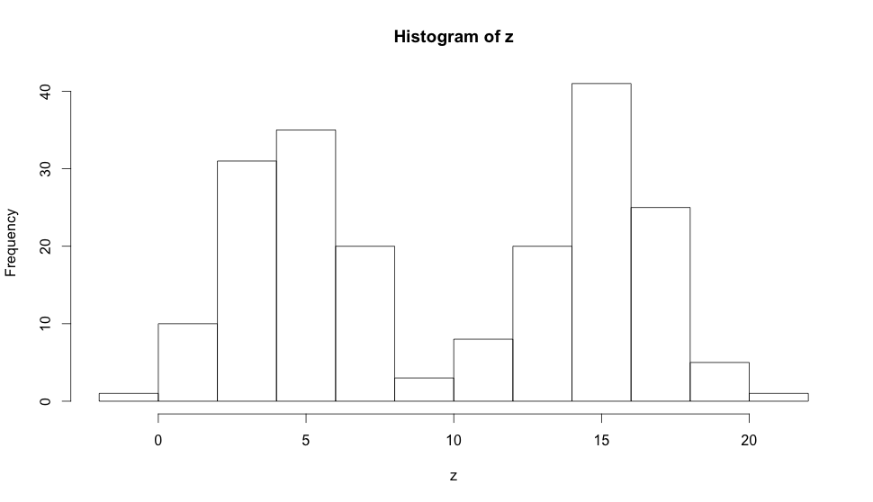
And they can also be uniform (when there is no prominent peak) or multimodal when there are more than two prominent peaks. Modality is important because it shows trends in your data, if the data you collected produces a bimodal histogram it’s very likely that you’re dealing with two clusters of observations, so histograms are very important in exploratory analysis when you’re still trying to figure out the trends and relationships in the data collected.
Boxplots
A generally lesser known visualization is the boxplot. Let’s look at a GDP per capita one:
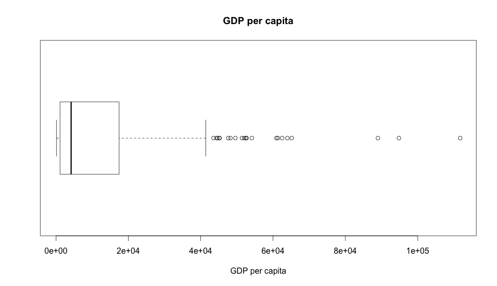
The box above is the interquartile range (IQR, where 50% of the data falls into) and it’s incredibly useful to find outliers as you can see from the dots to the right of the box. This leads us to believe there are many outliers at our GDP dataset which isn’t exactly unexpected as we know we have much more poor people in the world than rich ones, unfortunately. Also, the notch inside the box is the median of the dataset.
If we build a boxplot out the life expectancy:
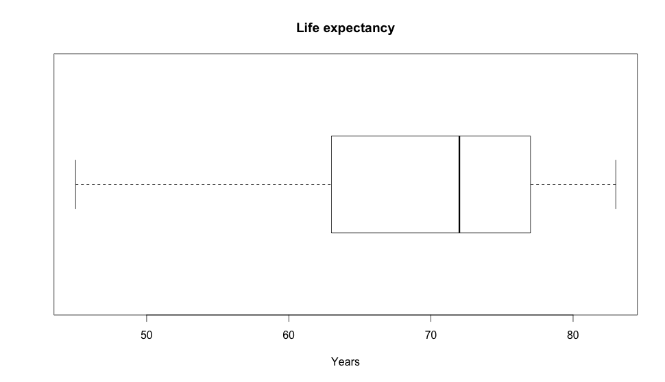
And at expectancy we have much less outliers, but we can still see how the values vary there as well.
Measures of center
Measures of center are the values we use to calculate the midpoint or averages of a distribution of values. A common measure of center is the mean that is basically the arithmetic average of all values, sum them all and divide by the count of values and you will have the mean of your distribution.
Another measure is the median that is the midpoint of the distribution. If your distribution was the values [1,2,3,4,5,6,7,8,9] the median would be 5, since it is the value that divides the distribution in two collections of the same size. If we had an even number of values, the median would be the two values right in the middle divided by two.
You can also have the mode of a distribution that is the most frequent value for it. Modes are usually not very useful unless you have a very small subset of possible values that repeat a lot. You can also figure out the mode just by looking at histograms.
Measures of spread
As we measure the center of the data we also measure how the data goes from one end to the other. One common measure of spread is the range of the data. Looking at our life expectancy dataset we see that values range from 43 to 83 so the range is 40 years. While that’s a lot, it doesn’t tell us much, as we’ve seen on boxplots and other examples above, this type of calculation gives too much power to outliers and might hide the actual trends of the data.
To fix that, we have two other related measures of spread, variance and standard deviation. The formula for standard deviation is as follows:
For the variance formula just remove then square root.
So, for our expectancy dataset it would be something along the lines of:
Which will give us the value of 95.7827 which is correct but it’s not at the same unit as our value. What do we do? We calculate the standard deviation that is just the square root of the variance, which will be 9.786863 which means most of the values will be 9 years away from the mean that is 69.41.
Robust statistics
To decide what kind of measures of center and spread you should use, you need to look at the data you’re working with. We say that robust statistics are those measures that are not greatly affected by outliers at the dataset and non-robust as the ones that are.
Looking at the measures we’ve seen, when measuring center, the median is more robust than the mean because it’s not affected by outliers as the mean is. In a small example given the following values:
[ 1, 2, 3, 4, 5, 6 ]
Our mean is 3.5 as is the median. But if we replace the 6 with 1000:
[ 1, 2, 3, 4, 5, 1000 ]
The mean is now 169 but the median stays at 3.5. Since the mean is the arithmethic average of all values, any outlier will affect it pulling it’s value towards it’s direction while the median stays at the same place.
When measuring spread we can see the same happening at standard deviation and variance because they both use the mean to calculate their values, so they’re not very useful for values with lots of outliers. In this case you would use the interquartile range (IQR) we discussed at boxplots, as it’s less likely to be affected by outliers in the data.
So, when you need robust measures, avoid means, otherwise be happy and use them.
Data transformations
Sometimes it makes sense to transform the data collected to make it simpler to model the relationships we see in it. For instance, we might run a log10 operation at our GDP per capita data to make it smoother so we can have a clear linear relationship between GDP and expectancy. Let’s look at how the plot looks like:
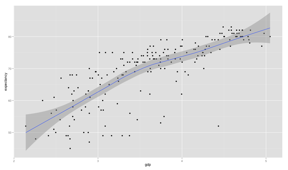
So now instead of a curve, we have a line going along the values. Let’s look at a histogram for the same transformed data:
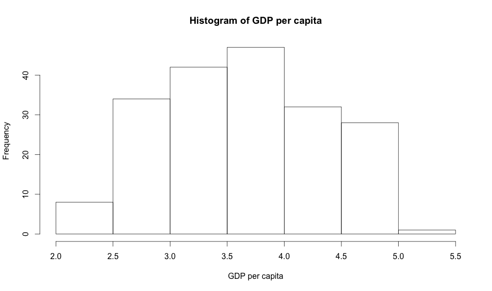
Now instead of the original right skewed histogram, we have a mostly symmetric one. While this is not representative of the data anymore, it greatly simplifies building and applying models to the data.
You could do many other transformations like squaring values to push outliers even farther, divide 1 by the actual value and so on. But you should only apply transformations when it gives your model or representation some actual value instead of just trying to run a log 10 just because the data is skewed.
Exploring categorical variables
Now that we have seen many different ways to visualize numerical data, we will do the same for categorical variables. One way to look at a single categorical variable is the barplot:
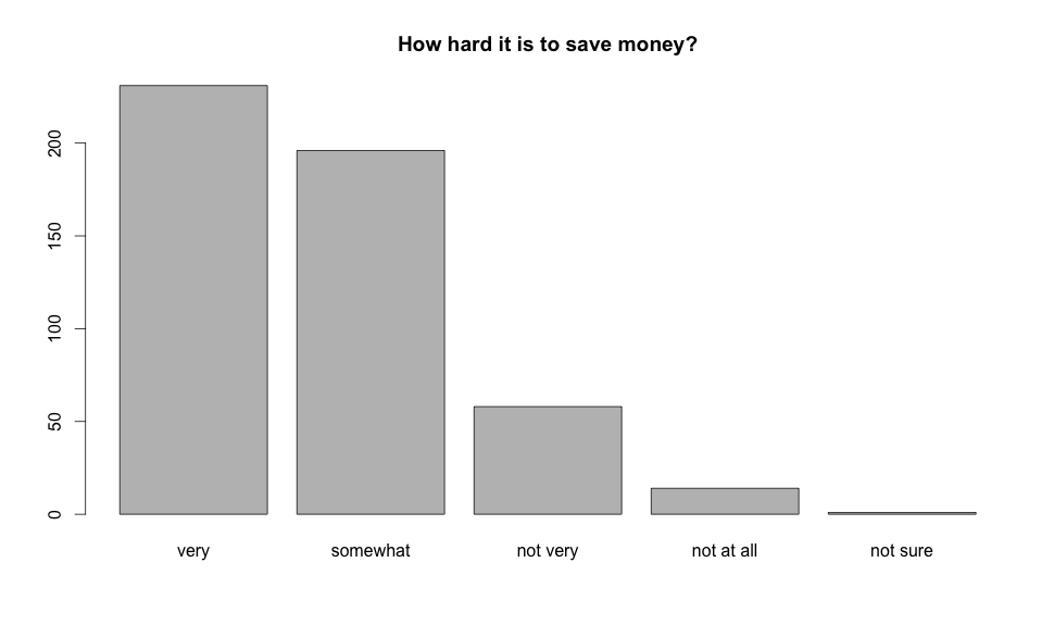
By looking at the plot we can see that the most of the people involved in the survey think it’s hard to save money. While it might look like a histogram, a barplot is different because there is no expected order for it’s bars, different than a histogram that will have each bin ordered by the range of values it represents.
Every single bin in the barplot means the amount of people that gave that same answers and it is ordered the way it is only because the variable is a ordinal categorical so it makes sense for it to be in one specific order, if the variable wasn’t ordinal there wouldn’t be way to order it anyway.
We could also use a contingency table to do the same (but I’d rather use the barplot anyway):
difficulty | counts
---------- | ------
very hard  | 231
somewhat   | 196
not very   | 58
not at all | 14
not sure   | 1
---------- | ------
total      | 500
But our actual dataset offers more data, we can segment the answers by the reported income of the sample surveyed. One way to look at this data is by using a segmented barplot:
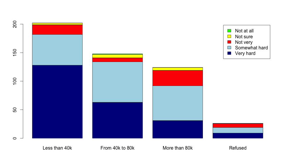
Now we can see something else, as the income grows the difficulty to save money goes down, so we have an association between these two variables here. As people make more money, they think saving money is easier, if they make very little saving money is definitely much more complicated.
We can also use mosaic plots to get a better perspective on the percentages of answers for each group as below:
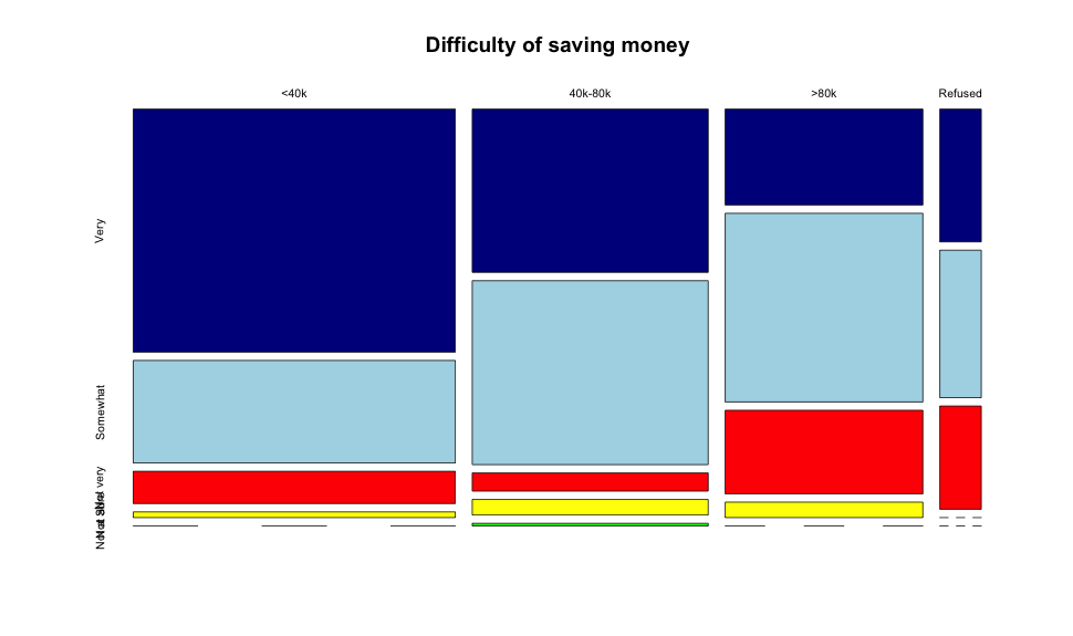
With mosaic plots we can see each group on it’s own (instead of based on the counts as barplots) and this allows us to detect the biases in each group more cleanly. For instance, if we look at the below 40k bracket and compare it with the more than 80k one it’s clearly visible that people above 80k are much more likely to think it’s somewhat difficult than very hard, while most of the 40k respondents think it’s very hard.
Introduction to statistical inference
In this section we’re presented to a case study (made in 1972) that wanted to understand if there was gender discrimination when deciding to promote people or not. The study polled 48 male bank supervisors, they were all given the same personnel file, the only difference was the gender all selected using random assignment. At the end, 35 of the 48 resumes received a promotion.
Let’s look at the data:
gender | promoted | not promoted | total
-----  | -------- | ------------ | -----
male   | 21       | 3            | 24
female | 14       | 10           | 24
------ | -------- | ------------ | -----
total  | 35       | 13           | 48
With the data collected, we have to define our two competing claims. First, there is the null hypotesis, in this case it is that there is nothing going on, gender does not affect the decision to promote a person or not. At the other side there is the alternative hypotesis that claims there is something going on and the gender does affect the decision to promote a person or not.
Now let’s start charting the provided dataset. Since both are categorical variables, we’ll start with a mosaicplot:
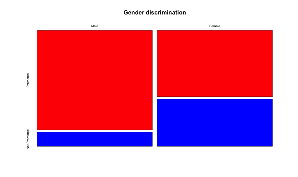
From the chart there is a clearly visible difference between males and females being promoted. Inside the male group, more people were promoted than not when compared with the female group, but since this is a mosaicplot (and it compares every group in separate) we don’t know if the amount of applications was the same. To figure that out we need a barplot:
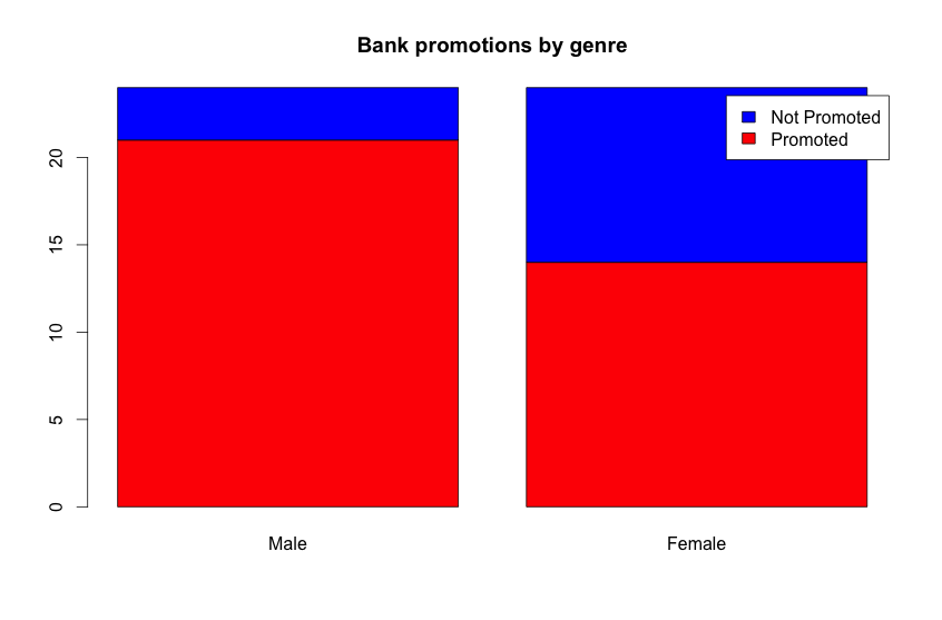
From the barplot we can see that the amount of resumes presented were the same (24) but the difference in the chart is quite visible, much more women weren’t promoted than man, nearly 3 times more.
Now that we have collected and looked at the data, we must evaluate it as the evidence for our case. Could mere chance cause this difference in the experiment? If it could, then our null hypotesis would be the correct one and there wouldn’t be any gender bias when evaluating these resumes.
To figure that out, we need to simulate the probabilities of the outcome, which is reaching out a nearly 42% of non-promotions randomly picking observations from a dataset where we know 35 got promoted but 13 weren’t.
Let’s simulate this right here, we’ll have an array where values 1 to 35 will mean that the person was promoted and from 36 to 48 it wasn’t. We will randomly select numbers from this array, two groups of 24 and we’ll evaluate how the promoted and not-promoted values will get distributed. To verify the null hypotesis our simulation has to consistently produce one group having much more promotions than the other, otherwise it means that the null hypotesis is false and our alternate hypotesis has to be considered.
Use this to execute the experiment: Execute
Current shuffled collection:
Males:
Result values:
Promoted:
Not promoted:
Females:
Result values:
Promoted:
Not promoted:
As you keep clicking on Execute you’ll see that it’s really hard to reach the same distribution as the one provided by the experiment. Most of the time the values will be really close to each other instead of disparate as they are in the study, which leads us to conclude that there actually is an association of gender with getting promotions as our random simulation has made visible that reaching the study values is really hard.
And this concludes the introduction to statistical inference and simulation for this week and the first week summary. Now let’s get to week 2!